Design Portfolio
Nitro Cafe Menu
The Nitro Cafe is a fictional restaurant located in the heart of downtown New Bedford, MA. The theme of the restaurant is bar/grill with an emphasis on drag racing. The menu below was designed as part of a class assignment. The objective of the assignment was to understand unity and consistency in the design of a multi-page document. The idea for the Nitro Cafe came to mind because I am an avid drag racing fan and I like to promote the sport as much as possible.

The front cover is an illustration of a turbocharger, which is used as a tool to increase horsepower in drag racing. The turbo took over 10 hours to complete and was inspired by a photo I had taken earlier in the year. I wanted the restaurant to make a connection with gear-heads all across the world and I believe I met that goal.
NHRA Currency
The NHRA (National Hot Rod Association) is a drag racing governing body, which sets rules in drag racing and hosts events all over the United States and Canada. This form of currency was created in an effort raise more awareness for the NHRA as part of a class assignment. The objective of the project was to create a currency with any type of theme.
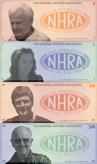
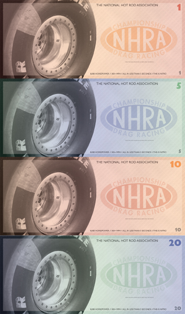
The currency was to be “fictionally” printed and used by the United States as the national currency. Currency holders would see famous NHRA personnel on the front of the bills, and a slick (sticky tires used in drag racing) on the back. The sport of drag racing would reach every citizen of the United States.
DRAG Campaign
DRAG – Drag Racing Association for Girls. The aim of the DRAG campaign is to raise awareness to the lack of females participating in the sport of drag racing. We were instructed to create a campaign for a cause or organization of our choice. The campaign had to occupy both a virtual and physical space and needed to have a minimum of 4 design pieces included with it.
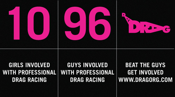

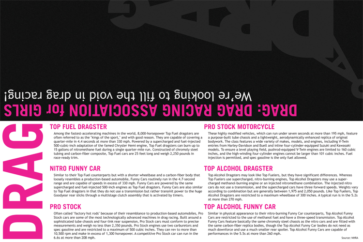
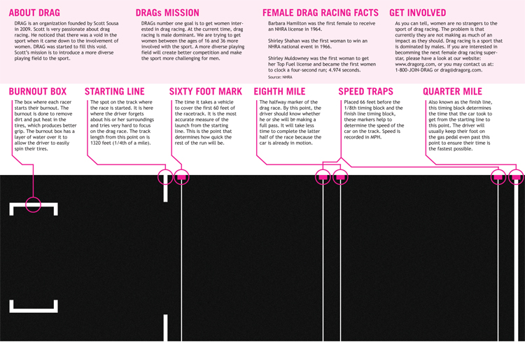
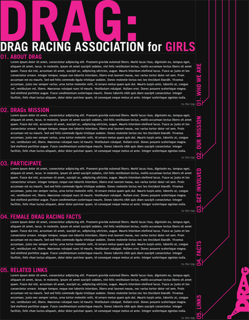
The objective of the DRAG campaign is simple: get more women interested and involved in drag racing. I chose to create a logo that looked like a Top Fuel Dragster for my first piece of collateral. After creating a logo, I created two full-size billboard advertisements and a full color brochure which would contain information about drag racing. For the final piece of collateral, I chose to create a website that would be used in a manor similar to the brochure, but in a virtual space.
Massachusetts Driver’s Manual Re-Design
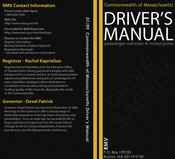
Around 2009, the Massachusetts Driver’s Manual had front and back covers that were very childish in nature. I felt that the message conveyed to new teen drivers was not accurately represented. Teenage drivers should take driving seriously. I chose to re-design the driver’s manual for yet another class assignment. For this assignment, we were to re-design a book cover of our choice. We could re-design any book cover as long as there was a physical hard copy available.
I designed the entire cover to look like top-down view of a two-way street. The front cover features double solid yellow lines of the road. I created an asphalt texture in Adobe Photoshop and then moved into Adobe Illustrator to complete the rest of the cover. The font on the front cover was meant to look like it was painted on the asphalt (much like you’d see in a school zone or similar). Unfortunately, when I first printed the cover, the drive safely watermark was not visible to the consumer so I had to make some adjustments to the final design. In the end, I was happy with the look of the new cover. I felt like the seriousness of driving was conveyed in a much better way than the original childish design.
USA Kayak Tours
USA Kayak Tours is a fictional company for which I chose to design a logo and website layout for. Designed in 2009, web 2.0 was the premise behind this website.
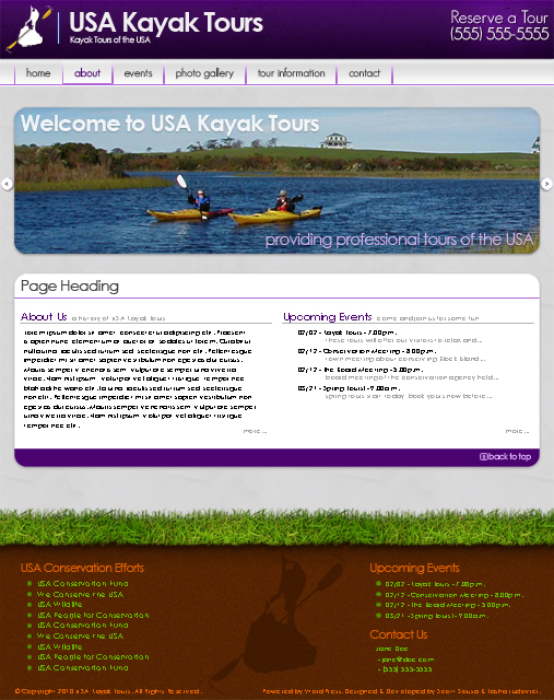
The logo features an island “kayaking” in the ocean and was created by myself in Adobe Illustrator. The website layout features a scrolling photo gallery on the home page with highlights about the company. The website design is broken down into three sections (header, content, footer) with the footer being the most distinct of those. I chose to separate the footer from the rest of the design by implementing grass found along many of the kayaking areas in New England. Unfortunately this project was never completed due to circumstances beyond my control.
Avant Garde Poster
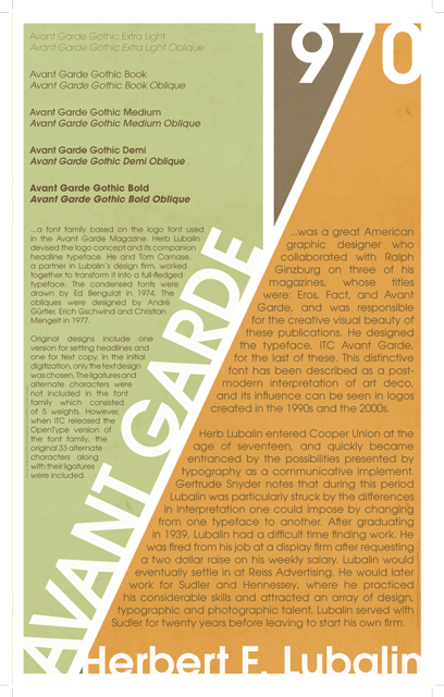
Avant Garde is a typeface that is considered to be a geometric sans serif. This means that the basic shapes within the font were created from circles and straight lines. This relates back to the 1920s German Bauhaus movement.
The Avant Garde typeface was released to the public in 1970. Herbert Lubalin, the designer, had originally decided to create a font specifically for the “Avant Garde” magazine. In 1968 he completed the font and decided to release it in 1970 for use by the public.
This Avant Garde poster, designed in Adobe InDesign, demonstrates the choice of using only one font throughout a design. It informs the reader about the Avant Garde typeface and attempts to match the original mission of the font. I chose Avant Garde because I believe that it is a well-designed typeface. The poster is based largely on the typeface’s design as well as the release date of 1970. It also features the 5 different weights that are provided within the original font family.
Herbert Bayer Postcard

I created this postcard for an assignment in my Basic Digital Imaging class. The assignment instructed us to create a sock puppet and a postcard that was based on any designer. I chose Herbert Bayer, an architect and a man who interested in typography who was born during early the 20th century.
I designed my sock puppet based on “Universal”, one of the typefaces Herbert created. My puppet design is very simple, yet it still showcases the interest that Bayer had in typography. This assignment took me well over 8 hours to complete. The postcard was to be professionally printed at MOO. If interested, my classmates’ puppet/postcard designs can be found on Flickr.
Turf – A Drink for All Athletes
Turf is a drink that was created for all athletes. The concept behind the name comes from the fact that every sport is played on a type of turf, whether it be grass, Astroturf, or asphalt.

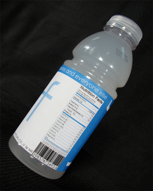
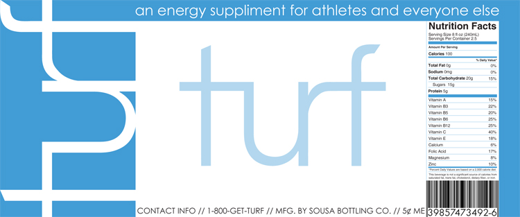
I designed this drink label with the average sports player in mind. The class assignment stated that we had to create a label for an already existing company or one that we would create. During my brainstorming session, the term “turf” came to mind. However I initially struggled with the design concept. Eventually I found that the letters in the word “turf” flowed seamlessly together and thus the basic concept for the label was born.
(RED) Campaign Bag Design
I chose to design a shopping bag for the (RED) brand for another class project. The assignment stated that we had to design, or re-design an existing shopping bag of our choice. After a bit of research, I came across the (RED) campaign. The (RED) campaign is an excellent campaign run by some of the world’s most iconic brands. These brands will donate up to 50% of the proceeds on (RED) products to help fight HIV/AIDS.
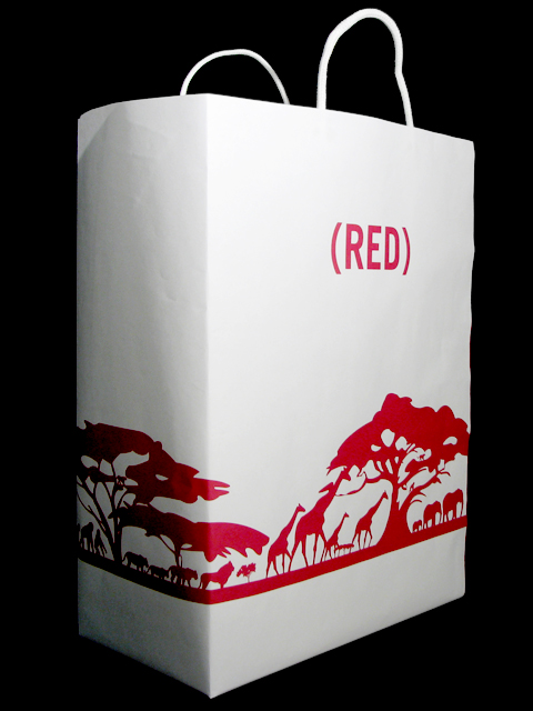


The final size of the shopping bag was 16″ x 12″ x 5″. Since the (RED) campaign mostly provides help to people of Africa, I chose to create vector shapes of various trees and animals found there for use in the bag design. I also created vector shapes for the foliage found in Africa. The final bag design was to depict a 360 degree seamless view of the African horizon.
Johnson & Wales AIGA T-Shirt Design Contest
The AIGA is known as the professional association for design. With the help of myself and a few good people, Johnson & Wales University in Providence founded its own AIGA Chapter in Rhode Island in 2007. After establishing the chapter, we held a design contest to create the official t-shirt for the chapter. Members could submit any number of t-shirt designs. Below are three submissions I made to this contest.


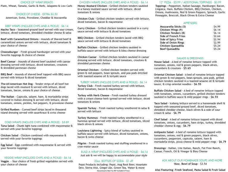
That’s A Wrap Restaurant Menu Re-Design
While working at That’s A Wrap Restaurant during my time at Johnson & Wales University, I took the opportunity to re-design their menu. That’s a Wrap aimed to bring their customers the best product available at an affordable price. Unfortunately, due to the economy and circumstances beyond their control, the business closed its doors in 2010.